Why the Colors of Your Promotional Products/POS Matter: Black and White
The color of your promotional products matter more than one might think. This is due to something called color psychology. Check out our post here for more information.
Each color has a unique set of emotions and feelings associated with them. You want to select colors for your promotional products that are associated with the emotions you want your consumers to associate with your brand.
In this blog post, we will highlight the effects of using the two classic colors of BLACK and WHITE.
BLACK:
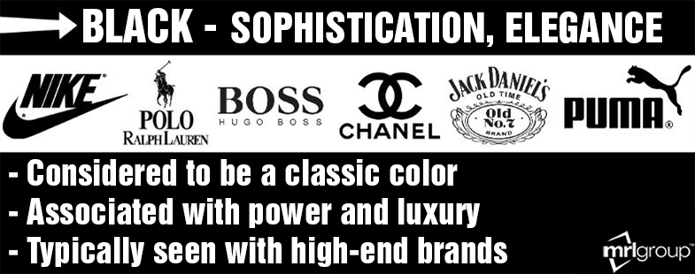
Here is a graphic our team made to give you an overview of the main things associated with the color black:
The color black is seen as a color of control and power. It is sophisticated and dignified. Black is a great choice for businesses that want to portray luxury and elegant items or services. High-end brands, especially in fashion, like to use the color black. Using this color to package your promotional products can portray the feel of the items being of higher value and potentially more expensive. It also creates a classy impression, especially if glossy.
Black is seen as a trendy color, and it tends to appeal towards a younger market if that is the audience you want to target. While black is a color of elegance and mystery, it can also be a color that can come across as unfriendly or cold. It is a color that can be strategically beneficial, but it is important to always keep your company’s image in mind. While some companies using promotional products at a high-end event might want to consider using black, companies using promotional products for a charity event should probably lean towards alternative colors.
One thing is certain by selecting this color though: black remains a sleek color that emits a classic feeling.
WHITE:
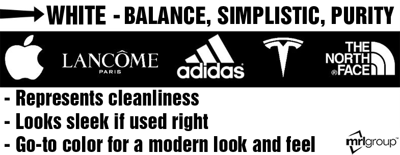
Here is a graphic our team made to give you an overview of the main things associated with the color white:
The color white is another classic color, and is one that portrays a clean and simplistic feeling. White is the color of cleanliness and can be viewed as a representative of new beginnings and peace. This is a color that many associate with a feeling of equality, fairness, and freedom.
Due to white’s clean and sleek look, it is great for companies working with technology, or with any company trying to portray the feeling of efficiency. The downside of white is that some view it as a very “plain” color that is empty. Others view this simply as being neat and orderly. White has become a go-to color for creating a modern feeling if utilized in a tasteful manner. This is a color that represents balance to many and should be utilized mainly by companies or for products that want to convey a simplistic and pure feeling.
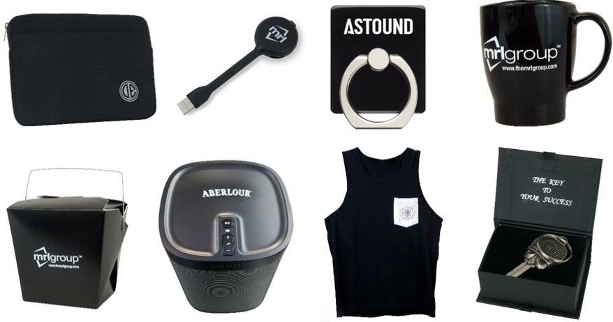
Black and white are often used together for an extremely classic look. Here at MRL, we have produced an immensely large amount of black and white products. Here are just a few examples of previously made promotional products using these two classic colors of black and white to give you a small taste of what MRL can create for your company.
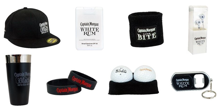
Black and white are colors that are extremely trendy and can be a good fit for the majority of promotional products. We created a whole line of black and white promotional products for Captain Morgan alone. Here are some of them:
Want more in depth knowledge of any color? Check out our color glossary here.
If you have any questions, or if you are feeling inspired, then contact our team so we can bring your colorful vision to life. At MRL… we aren’t afraid to think outside of the box and color outside of the lines.


